The appearance of any packaging plays a key role in the shopping process for the customer. What is more, consumer decisions are made in several dozen seconds, with only a few being spent on looking at a single product. The process of ensuring that our goods are the ones that attract the eye of the customer for longer begin with the development of the packaging. However, to what extent do we consider the interaction between the packaging and lighting on the store shelf during this process?
When designing a product, attention should be paid to where it will be distributed and how the outlet, drugstore or boutique illuminates their shop windows and shelves. This is not standardised in any way, but is something known as light marketing, and which has long been used in stores selling specific merchandise.
Skilful use of light
How is light used to boost sales? By way of illustration, most stores selling meat tend to use light with a slightly pink hue. This makes red meat look fresh and of high quality. Interestingly, clients prefer white light for fridges offering poultry and fish. Light with bright but warm colour shades is also used to illuminate clothing and … cosmetics.
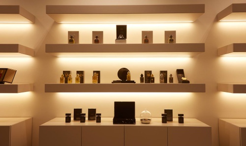
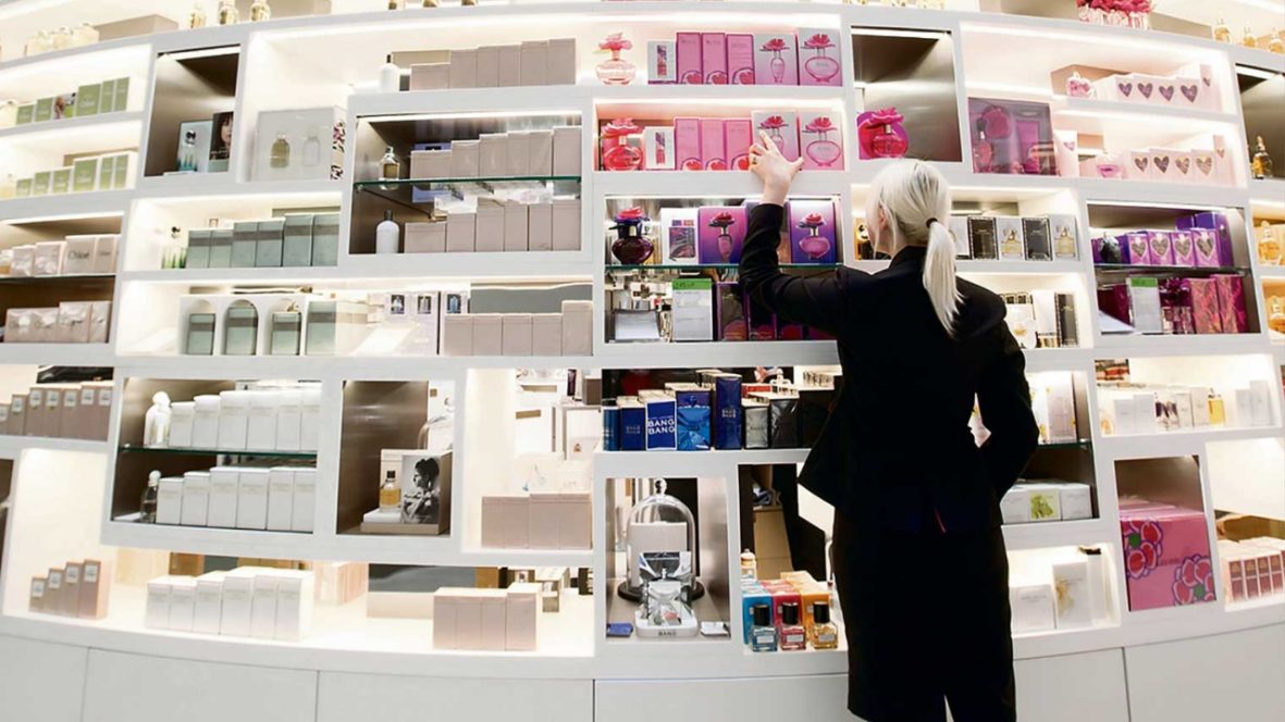
The selection of the right type of light relies on thorough research, which makes the skilful play with light increasingly popular. When it comes to cosmetics and perfumes, especially at the high-end segment, products may be picked out by accent illumination. The aim of using such a spot light is to emphasise the visual qualities of a particular package.
Packaging design
The packaging should be checked in terms of illumination on several levels. This includes protecting the packaging against the adverse effects of dim daylight, artificial lighting of various types and intense sun exposure. In some cases, this light may contribute significantly to fading, cracking of the packaging or chipping of the lacquer finish.
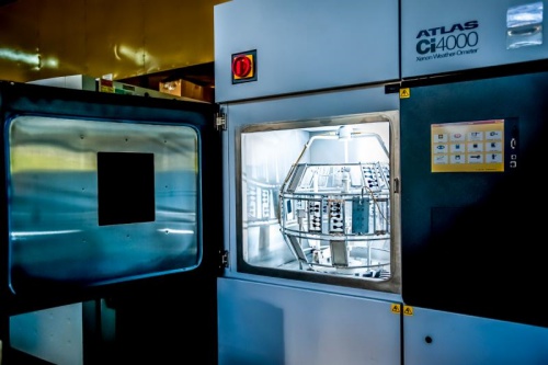
Photo. A machine that tests the resistance of details, including light resistance
Secondly, specific lighting reveals cracks, bends and other errors in the packaging. The packaging should also undergo tests in terms of marketing – that is to check how the packaging looks (that it does not take on a different colour) under specific lighting conditions and to check it attracts the customer’s attention.
How the cosmetics and perfumery packaging interact with light
Most often the manufacturer has no direct influence on the lighting available in the store where the product is to be displayed. Nonetheless, with some general knowledge about the lighting typically used by outlets selling goods from our industry, we can already begin to adapt our packaging.
Cosmetics and perfume companies employ different tactics to attract the eye. Certainly, not all of them try to attract the customer’s attention with shiny, flickering and sparkling effects. Many companies rely on minimalism and subdued colours, which constitutes a completely different strategy. Below we will examine different examples of gaining the customer’s attention via appropriate use of light and product packaging specifications.
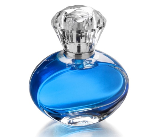
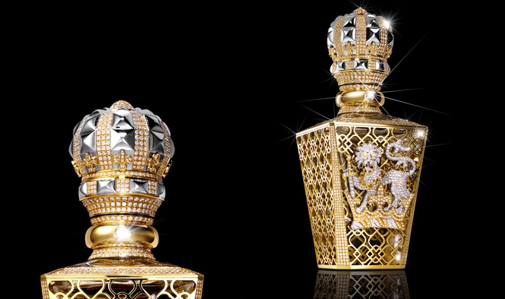
The bending of light is one such example. This effect is a well-known one, as it occurs with diamonds and crystals. The multitude of surfaces combined with a high level of transparency result in countless sparkles. The packaging, or an element of the same, using such an effect attracts the eye and gives the impression of luxury.
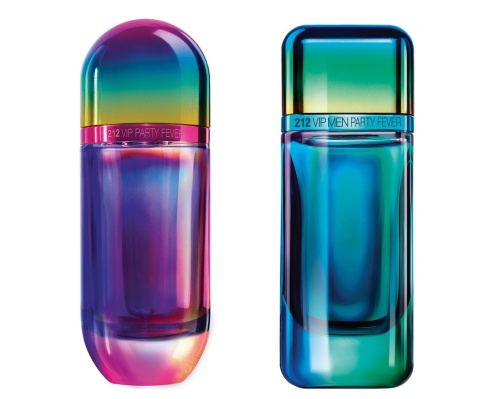
Another option to interact with light is to use staining, which shimmers in several colours or is recognised by the human eye as different colours, depending on the type of illumination. The cosmetics and perfume market is not short of packaging that shimmers in colours like a rainbow, or which looks completely different in under various hues of illumination.
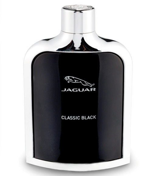
Metallisation is another packaging style that uses the reflection of the in-store lighting to attract the final customer’s eye. It gives packaging the appearance of having a metallic, almost chromed coating. A layer that reflects like a mirror not only makes the packaging look more exclusive, it also redirects light and images as we find in a mirror.
It is worth considering where our product will be presented already during the packaging design phase. By being aware of what lighting is used in such places, we can make design choices so that our work enhances the product appeal as effectively as possible, and encourages the customer to make a purchasing decision to our advantage.
Powrót do listy artykułów
