This is not the first time we have focused on the importance of colour in our articles, including those we publish in the industry press. This time, however, we would like to delve into the relations between colours and particular cultures. The way the brain perceives a certain colour, and what it associates it with, can differ vastly, depending how our understanding of it has been shaped by our culture, religion and politics. As a result, these factors may actually have a tremendous impact on the purchase decisions made by consumers.
The importance of colour
The influence colour has on humans has been known for thousands of years. Even though their exact effects were unknown, many conclusions could be drawn from observing human reactions to particular colours. Now we know that colours affect our brain, which in turn orders our body to secrete certain hormones to achieve specific reactions (increased blood pressure, wakefulness, increased focus or calmness).
As a result, we use colours in areas such as chromotherapy, which is a form of treatment involving the use of colour. This is a popular Chinese method for treating neuroses and depression, as well as reducing pain and the symptoms of digestive and respiratory system disorders, among others. The establishment of colour psychology as its own area of study further proves how strongly colours can influence the human body. The impacts that colours have on human health has also been an object of study by people such as Johann Wolfgang von Goethe (in his 1810 book “Theory of Colours”) or Niels Ryberg Finsen. The latter was awarded the Nobel Prize for his work on the applications of ultraviolet light in treating diseases.
Ultraviolet light therapy. Photo
Colours in marketing and sales
It was only a matter of time before colours began to be used in commerce and marketing. Choosing the right colour in the world of commerce is primarily about achieving the right packaging, a well though-out brand logo and coherent visual identification as regards employee uniforms and all other marketing and promotional activities. Which colour should be chosen depends on what it is intended to represent.
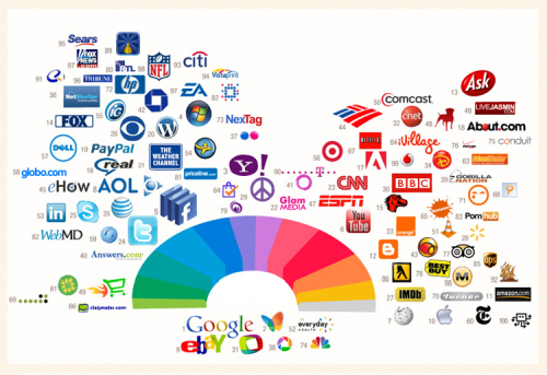
Logos of the most popular brands on the color palette. Photo
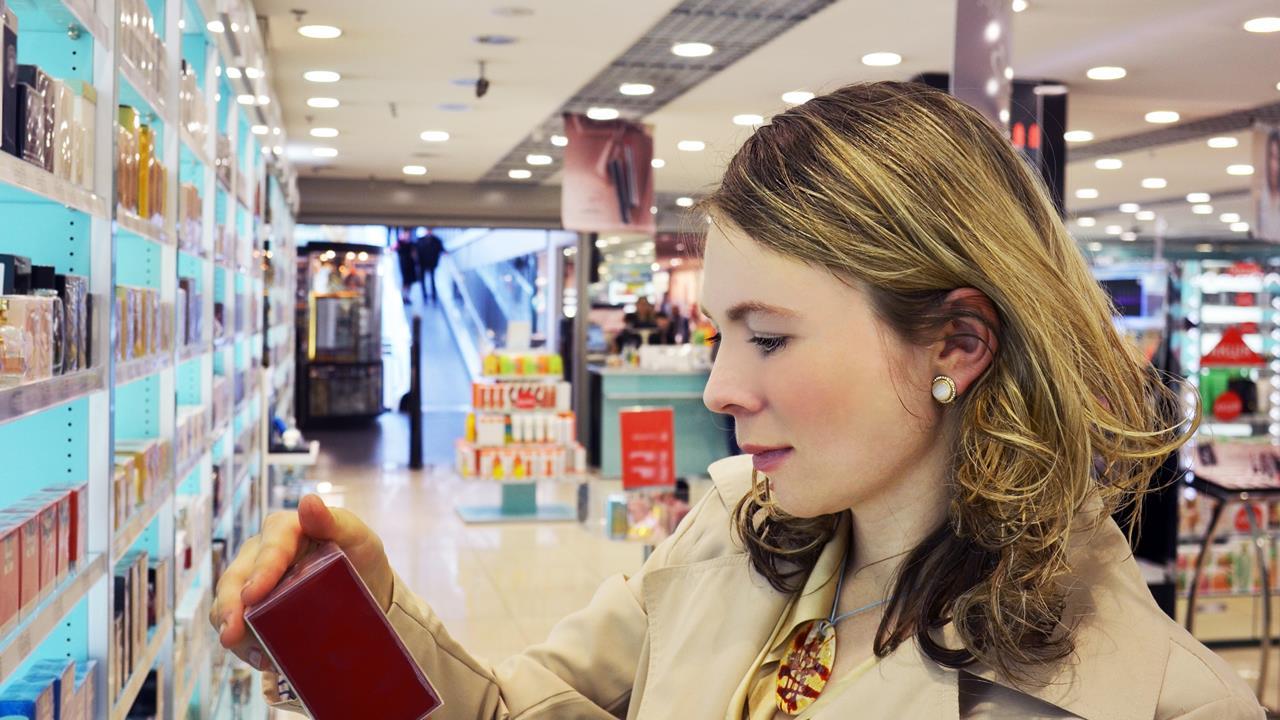
The colour of the product packaging is key in the sales process. In addition to its colour and graphics, the packaging should match the brand, the type of product, the target group, the culture it is to be sold in and even the lighting used on the shelves. As you can see, there are many factors at play here, and all of them should be taken into account, especially as no less than 65% of customers believe that colour is the single most important aspect in driving their decisions. Choosing the right colour can evoke the desired reaction in the consumer’s body. As an example, red can encourage customers to make a product purchase decision 12% faster.
Colours and cultures
When expanding into foreign markets, how our brain perceives particular colours is not the only thing we should keep in mind. It is also a good idea to delve into the local culture and learn what significance particular colours have locally. Blue might make people feel safe here, but in Mexico it is the colour of mourning. Many cultural phenomena also include colours in their names, and the associations they might evoke can be unambiguous, such as in the case of the “Orange Revolution”, “Blackshirts”, “black mass” or “grey death”.
By far the most important of these, however, are the associations with religion, power (the colours of the clothes worn by rulers) or regional beliefs. This is where differences arise, such as with white,
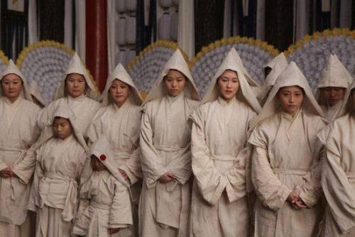
a colour symbolising purity and innocence in the West. In numerous African cultures, however, white is the colour of demons, as well as the colour of mourning in India. Using colours commonly associated with death and mourning in business, including the packaging and cosmetics industry, does not seem to be an ideal choice. Moreover, traps like this lurk at every corner… In South Africa, red is the colour associated with mourning, while in Egypt it is yellow and, as we have already mentioned, in Mexico it is blue.
China. Bright linen mourning clothes. Photo
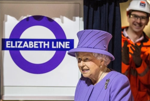
The colour used for mourning in the West is black, yet this is the colour of joy and happiness in China. In Japan, on the other hand, black is associated with adulthood, maturity and nobility, while in India it is known as the colour of life. Red is much revered in China, where it is perceived as a symbol of luck, good fortune and love. Blue is one of the best for sales in the USA and Europe, and has grown to be associated with luxury, purity and trust. Green symbolises life, spring and hope in most cultures, yet interestingly enough, in the United States it is often perceived as the colour of greed and envy. Violet is the kind of colour that is very distinct and yet evokes similar feelings across different cultures. It is mostly associated with wealth, high social status and power.
Queen Elizabeth II during the announcement of changing the name of one of the London metro lines in her honor. Of course in royal colors. Photo
Colour psychology and its associated marketing activities reach far beyond how our body reacts naturally to particular colours. Societies are largely shaped by their surroundings and culture, which means that there might be additional factors at play that influence purchase decisions. Before entering a foreign market, it is a good idea to take into account the various cultural factors which may influence how well a product sells. This is all the more true for cosmetics and perfume, which should evoke only positive feelings.
Powrót do listy artykułów


